Last updated on March 20th, 2024 at 06:24 am
If you have read through the first two parts of this website design guide, congratulations! You’re now ready to start your website development journey.
If you haven’t, take a few minutes to read through them. You will learn what a website is, how it works, and how fundamentals like website hosting, domains, and DNS help you design a profitable website.
This third part of the website design guide will cover website layout and how to optimize the user experience (UX). It’s one part of website optimization that can greatly increase how much money your website makes.
WordPress vs Wix vs Olitt
The first thing you should do is decide which website builder you will use.
Our recommendation is to use a free CMS like WordPress because this way, you get far more flexibility and customization options for your website.
Perhaps an even bigger advantage of using WordPress is that the platform is open-source, so it comes with no strings attached. With WordPress, the only limit to what you can do is your own imagination and technical skills.
That’s important because at some point you may need to switch website hosting providers, modify the website code, or change something else. Proprietary platforms such as Squarespace or Wix may not provide you that kind of freedom.
However, this flexibility also makes WordPress difficult to use for beginners. If you’re looking for an easy drag-drop website builder, skip this whole thing and use Olitt.
Why use Olitt to build your website?
Olitt is a free website builder platform that takes the hassle out of building, hosting, and maintaining a website. You get gorgeous pre-built website templates that you can adapt to fit your needs with minimal effort or skills.
Plus, Olitt’s in-house professionals are available 24/7 to help you with tasks like:
- Customizing the website design
- Creating engaging copy
- Search engine optimization (SEO)
- Integrating complex features, such as payments)
- Assistance with setting up e-commerce stores
Olitt is the fastest-growing free website builder because it’s very affordable and comes with amazing features out of the box. It helps you build extremely fast and user-friendly websites in minutes, all hosted on our lightning-fast servers.
What we love most about Olitt is that it scales easily and gives you freedom to grow without worrying about expensive fees and add-ons.
If you’re considering more options, learn more about Wix in the Philippines, or check out our website builder comparison between WordPress, Weebly, Wix, and Site123.
Still interested in learning the basics of web design? Good, let’s get to it.
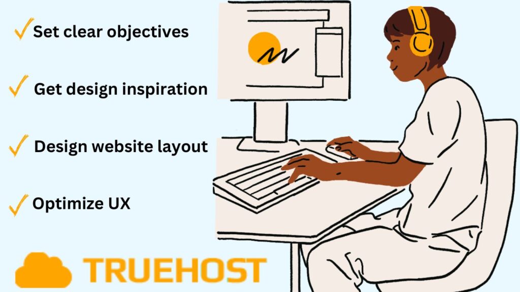
What is Website Design?
Web design means crafting the look, feel, and functionality of a website. You’ll be designing everything that the user is going to interact with, so this process is deeply customer-centric.
The main elements of web design include layout, images, content organization, information architecture, color scheme, readability, navigation, and content.
But before we get to all this, let’s set down the purpose and objectives of your website. This will give us a point of reference when making important design or layout decisions down the line.
Define your website design objectives
Starting a website without any concrete goals is asking for trouble. We strongly recommend that you take some time to develop your ideas and vision for the site.
Once your purpose is clear, define your objectives and write SMART goals. For example, do you want to build an audience or grow an existing business? Are you starting an e-commerce store to sell things? Is it a blog to express your thoughts?
Are you a freelancer creating a pretty portfolio to help you find more work? Or, are you simply starting a website as a hobby?
Don’t stop yet, your goals have to be more detailed and specific. In case you’ve forgotten, here’s what SMART means:
- Specific – clear and precisely defined goals, e.g, increase website traffic and conversion rate by 50%
- Measurable – have specific criteria for determining when objectives are achieved, e.g, website traffic and conversions are easily measured
- Attainable – the goals are realistically achievable using current resources and time limits
- Relevant – your website goals should be relevant to the success of your business in terms of revenue or mission, e.g., you can increase website traffic by using content marketing for higher Google rankings
- Time-bound – have a specific deadline for achieving the set goals to create urgency and help with planning, e.g., increase website traffic by 40% in the next 6 months
SMART goals give you a practical guide to follow when deciding on things like accessibility, brand building, and navigation.
Website Design Examples for Inspiration
It’s sad how nowadays, many websites focus too much on aesthetics and neglect user experience.
Have you come across websites that use annoying full-screen images, carousels, or animations? If you haven’t, you should try one with scroll-triggered animations. Apple is one example that uses animations heavily—check out the Vision Pro page.
A site like that one makes you go “Wow!” the first time, but all that endless scrolling makes subsequent visits incredibly annoying. Sometimes my finger hurts because I have to scroll so much!
Plus, if you’re loading such a website using a slow internet connection, you’re in trouble.
In short, if your goal is to present information, make it easy for users to find. Navigation and content organization should be the top priority.
If your main purpose is to sell a product or service, product listings and the user journey should guide your design process. If you’re selling B2B products, your goal is to nurture customer relationships and inspire trust.
The advantage of designing your own website is that you get to optimize it from the ground up to serve a specific purpose.
Website design ideas and where to find inspiration
If you’re just building a simple starter website with free themes and templates, there’s not must need for creative inspiration. Most free website builders give you limited flexibility. Move ahead to the section on free WordPress themes.
However, if you’re someone with a vision for what you want your website to be eventually, it helps to go through some gold-standard websites for inspiration.
You can find website ideas and inspiration from many sources. Websites that are particularly creative, well-executed, visually stunning, and functionally flawless can help you get started.
Awwwards is the best place to find website design inspiration. The platform ranks some of the best website designs in the world as voted by real-life professional designers.
Awwwards even lets you explore the most popular web design elements, such as cursors, animations, and typography, or you can filter by color, type, or functionality.
There are tens of other website galleries you can visit to learn the latest and best in website design. The most popular ones include the following:
- Landing.Love – landing page animations
- Mobbin – for more simple commercial websites
- Land-Book – landing page designs by category
- Built for Mars – UX design inspiration and guidance
- Call to Idea website elements
- Landing Folio – landing page design
- Page Collective – landing page and user flows inspiration
- One Page Love – one-page website design, listed by category, especially portfolios
- Lapa Ninja – more landing page design
- A Fresh Website – endless design ideas and themes
Whatever design or theme you choose for your inspiration, remember to keep things simple. User experience should always come before aesthetics for long-term success.
How to design website layout and navigation
Aspire to the simplest, most intuitive website layout and navigation you can.
That means you should work with as few elements as possible (sliders, buttons, images, etc). Don’t let a page look too busy or feel conflicting.
For starters, design the layout of every page following a visual hierarchy. That means you should think about how people read the content on the page, which isn’t top to bottom as one might think. Eye-tracking studies prove that most readers using a Z-shape or an F-shape pattern.
It’s widely known that we don’t read through every piece of content on a web page. Instead, we scan through it and stop to read if we find something that catches our eye.
A web page with a lot of content, like a blog page, should follow the F-pattern visual layout. Homepages, landing pages, and other website pages with less text and more graphics work better with a Z-shaped visual pattern.
Decide on website color and typography
In keeping with simplicity and minimalist design principles, you should have one base color for your site and use different variations to introduce elegant aesthetics. Play around with color saturation, light and dark tones, transparency, and other elements.
While at it, think about contrast, readability, and harmony between all the different elements of the webpage or website. For branding purposes, it’s important to keep your chosen color scheme throughout your website.
Typography also plays a vital role in the visual look and feel of a website. It even affects the vibe and personality of your site—some fonts are more playful, while others are formal and sophisticated. Your website’s purpose should help you decide on the right typography.
For example, while sans serif fonts are more elegant and classy, slab serifs are playful and bold. Similar to your color or theme, keep your typography consistent throughout your site.
Expert tip: The rule of thumb is not to use more than 2 fonts for your website. If you do decide to vary your fonts, don’t mix up serifs and sans serifs except to help improve contrast between headers and body text. Better still, find a font family so that you’re guaranteed of everything working together. For example, Source Serif Pro also comes with Source Sans Pro.
How to create website content
Content is the soul of your website. Various types of content such as page content, blog pages, sales pages, product listings, you’ll need to produce a lot of text to fill up your new site.
This is often the most difficult part of building a website. Our advice is:
- Have some content ready before you actually build a website
- Research your competitors – find out what kind of content they have and match or exceed what they’re doing
- Learn the basics of website SEO, including keywords, readability, links, responsiveness, and technical SEO
- Have a library of custom graphics (which you can make with Canva) and brand material you can reference as you go along to ensure brand consistency
- Don’t use placeholder text; take time to put in some content as you go along; you can always change this later. This is important for ranking
- Check the SEO score on every page and blog article and optimize it following the suggestions given. The Yoast SEO plugin is widely used for this
- If you don’t have experience with copywriting, work with an expert on your most important pages, such as landing pages and the homepage
Once your website is up and running, commit to posting blog posts regularly to build up authority and trust on search engines. However, remember that it’s a marathon, not a sprint so take things easy.
Expert tip: Keep all content top-quality and make sure it’s helpful to readers. In particular, don’t use AI content generators unless you know what you’re doing. You may need to write content yourself at first but, as your website grows, we strongly recommend that you hire experienced copywriters for writing blog posts and ad copy.
Best Free WordPress Themes to Use Today
If you’re a beginner, skip the whole layout, user experience, and navigation design part and use free themes or templates. WordPress themes bring you all that out of the box, and all you need to do to get started is make some changes and start posting content.
Thankfully, there are tons of free WordPress themes you can use that have already been tested and approved by expert designers and users.
One of the most popular free WordPress themes is OceanWP. It’s a gorgeous and lightweight theme with lots of flexibility, and responsiveness, plus it’s very easy to use.
Other popular themes for beginners, in no particular order, include the following:
- Kadence
- Blocksy
- GeneratePress
- Astra
- Sydney
- Vantage
- Ground WP
- Genesis
- Zakra
- Divi
- Storefront
- Bricks
- Go
- Hestia
- Neve
- Vogue
- Total
- ArileWP
- Colibri WP
- Ashe
- Vilva
- Foodica
- Fairy
- Hueman
For portfolio themes, check out Bold Photography, Virtue, Inspiro, Tracks, or Modern.
How to choose a WordPress theme
If you’re wondering how to choose a WordPress theme, we have a few tips for you. First and most important, use a popular theme with lots of downloads and positive reviews.
Highly popular themes give you confidence that developers will continue to provide support and maintenance. It also tells you that the theme has been tested and proven many times over, so most bugs have been worked out.
Most importantly, popular themes have large forums and communities of users where you can find help and information in case you get stuck.
A good rule of thumb is not to use a theme that has less than 10k downloads.
Secondly, don’t choose a theme because of the way it looks. It’s easy to change aesthetics with a little bit of training—typography, colors, and layout can all be customized on WordPress themes.
Instead, the important things to look for are:
- Theme responsiveness, which means how a theme adapts to screens on different devices
- Plugin support is super important for added functionality
- Regular updates from the developers to keep up with security, bugs, and other issues
- Functionality, such as navigation buttons, accessibility features, and cross-browser compatibility
- SEO – a good theme is lightweight and loads fast (under 3s) for a positive customer experience
Expert tip: It may sound counter-intuitive, but the best themes have minimum in-built functionality. Most themes support plugins, which you can use to add any kind of functionality you like. This gives you more flexibility because you can change the way your website works without having to change the whole theme.
How to Build a Website for Free in the Philippines
So far we’ve learned that so long as you purchase a domain name and pay for hosting, you can build a starter website for free. In fact, you even get a free domain name and free website hosting when you use the Olitt website builder.
As your website grows and generates revenue, you can upgrade to a premium package that gives you more options, such as a custom domain name, unlimited storage, customizable templates, social media integrations, and more.
However, if you want a free website that gives you more control and customization options, use WordPress. We have a detailed guide on how to build a free website here which has more information on starting a WordPress website.
Are websites free?
That’s a smart question to ask.
You’re probably wondering, surely you can’t get a website completely for nothing. What’s the catch?
You’re right, there’s a catch. With WordPress, it’s maintenance.
Is WordPress free?
We should probably correct ourselves and say that WordPress is not really free, it’s open source.
WordPress is an ultra-flexible platform with wonderful developers who have built lots of free tools and plugins to support WordPress. You can use these to build a website for free, but it won’t have a lot of functionality.
As your site grows, the free plugins and themes become inadequate. You’ll want better analytics, automated updates, automated backups, and other premium features. As you start to pay for upgrades, you may discover that the costs add up quickly.
On the other hand, by this point your website should be generating enough revenue that all this makes financial sense. A well-built and maintained website should generate some revenue within months of going live, either directly or indirectly.
The same goes for the Olitt website builder. You can build a free website with Olitt, no strings attached. You even get a free domain name and free website hosting. However, the free version may not be very useful for an e-commerce store.
That’s why it makes sense to pay for a cheap pro package, which gives you features such as a custom domain, DNS management, and unlimited bandwidth.
To continue learning more about website design and development, continue to Parts 4 and 5 of this guide.
 Web HostingCost-effective shared hosting solutions
 Reseller HostingStart your own hosting business without tech hustle
 Affiliate ProgramEarn commission by referring customers to our platforms
 cPanel HostingHosting powered by cPanel (Mostly user friendly)
 Windows HostingOptimized for windows based-applications and sites
 Domain SearchFind and register available domain names in seconds
 All DomainsExplore and register domain extensions across the world
 Domain Transfermove your domain to us with zero downtime and full control
 Whois LookupLook up domain ownership, expiry dates and registrar information
 .com DomainSecure the most recognized domain for global credibility
 VPS HostingScalable virtual servers. Full root access. Faster speed.
 Managed VPSNot a tech expert? Choose our fully managed VPS server.
 Dedicated ServersGet the full power and complete control of your own physical server.